Color Temperature and Harmony in Watercolor
Discover how color temperature creates depth and atmosphere in your paintings. Learn to build harmonious palettes using analogous, complementary, and triadic color relationships.
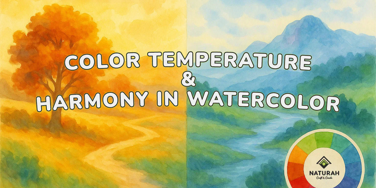
Temperature: The Invisible Color Dimension
Understanding color temperature – the warmth or coolness of a color – is perhaps the most important concept for creating convincing paintings. Temperature affects not just the mood of your painting but also spatial relationships, focal points, and atmospheric effects.
Warm colors (reds, oranges, warm yellows) appear to advance toward the viewer, while cool colors (blues, violets, cool greens) appear to recede. This principle helps create depth and atmosphere in your paintings.


Relative Temperature
A color isn't absolutely warm or cool, but warm or cool in relation to surrounding colors. Ultramarine Blue is cool compared to Cadmium Red but warm compared to Phthalo Blue. This relativity allows you to create temperature shifts that guide the viewer's eye and create atmospheric perspective.

Building Harmonic Palettes
Understanding color relationships helps you create palettes that feel unified and sophisticated rather than chaotic or muddy.

Analogous Harmony
Colors that sit next to each other on the color wheel naturally harmonize. A palette of yellow, yellow-green, and green creates peaceful, unified paintings perfect for landscape or spring garden.

Complementary Drama
Colors opposite each other on the color wheel create vibrant contrast and visual excitement. Orange and blue, red and green, yellow and violet – these combinations energize paintings when used thoughtfully.

Split-Complementary Sophistication
Instead of using direct complements, try using the colors on either side of the complement. If your main color is yellow, instead of using purple, try blueish purple and red-purple. This creates contrast without the sometimes harsh vibration of direct complements.

Triadic Adventure
Three colors evenly spaced on the color wheel (like red, yellow, and blue, or orange, green, and violet) create dynamic yet balanced color schemes perfect for energetic, joyful paintings.

Be the first to comment on this article!